Newstead Athletics embarked on an innovative visual transformation, blending its rich legacy with a forward-thinking approach. Research uncovered the club’s historic use of a capital ‘N’ as its emblem, setting the stage for the evolution.
A comprehensive review revealed a global shift in sports branding towards contemporary, non-traditional logos, steering away from conventional shield shapes. This strategic move aims to resonate with the burgeoning young audience, the torchbearers of tomorrow.
The challenge lay in crafting a symbol rooted in athletic prowess while honouring the club’s heritage. Analysis of action shots highlighted the ubiquitous presence of the ‘n’ shape in various athletic movements—block starts, long-distance runs, field events, and jumps. Hence, this form evolved into an inclined ‘n’-inspired logotype.
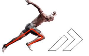
To signify our trajectory towards the future, the new shape was adorned with an arrow—an emblem of speed and progress. This arrangement, from left to right, mirrors the spectator’s perspective during track races, inviting all to witness our onward sprint towards excellence.
In choosing Futura as our accompanying font, we embrace a timeless classic—a font that has long defined modernity and elegance. Its bold, sleek lines echo the athleticism inherent in our pursuits, while its capitalisation evokes a sense of grandeur and unity. Paired with our new emblem, Futura harmonises seamlessly, lending a crisp, contemporary aesthetic to our visual identity.
With our new visual identity, we honour our past, celebrate our present, and eagerly embrace the boundless horizons of our future. Welcome to the new era of our club.
![]()